
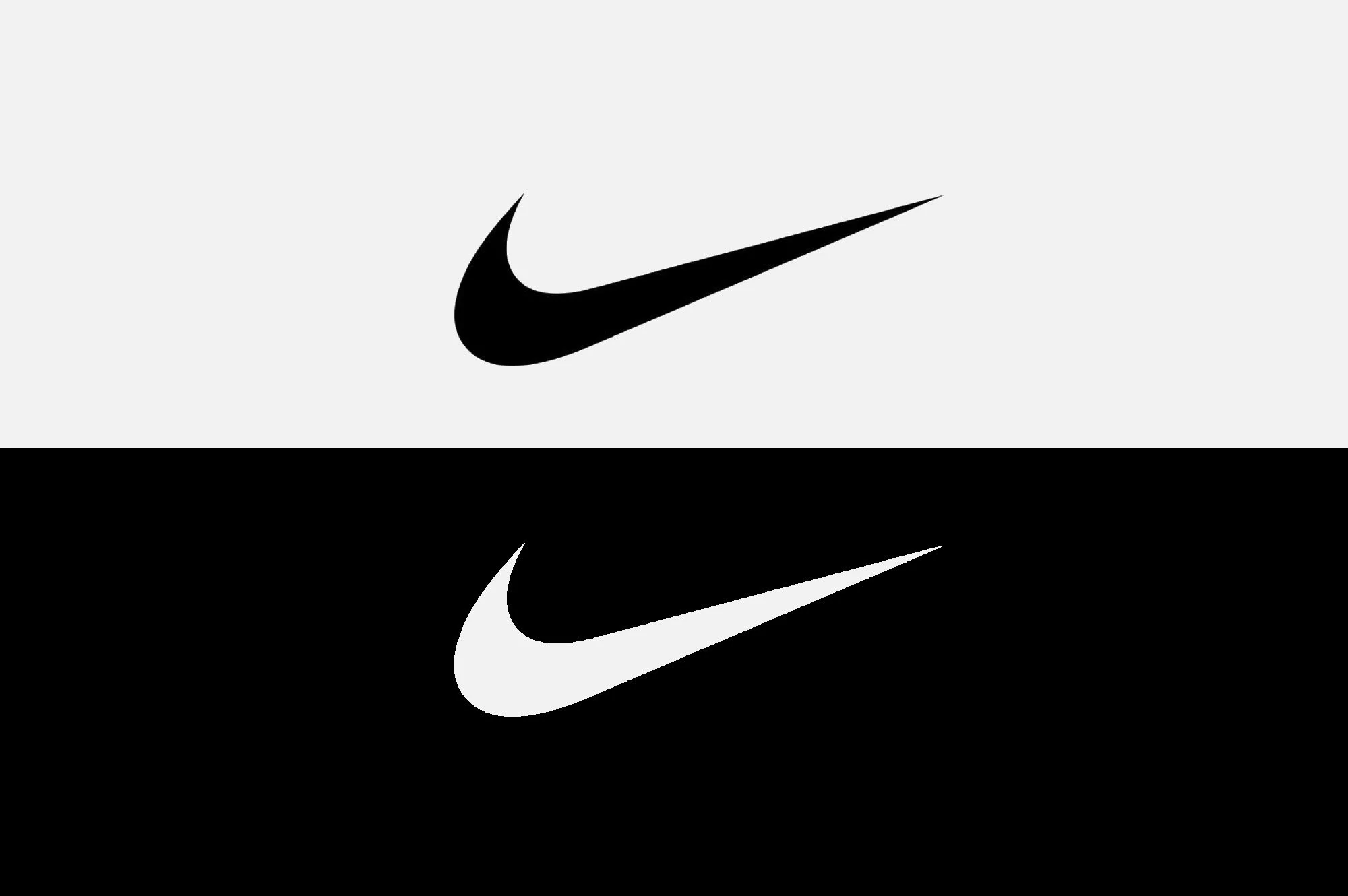
A great logo needs to do far more than simply look good. Here's how to tell whether yours is up to the job.
Your logo might look fantastic on your website. It might even look rather lovely on your business cards. But what happens when it's reduced to the size of a social media icon? Printed in black and white? Embroidered onto a uniform? Or blown up to the size of a building? Suddenly, that beautiful logo might not be looking quite so clever.
Because effective logo design isn't simply about creating something attractive. It's about developing a distinctive, recognisable and versatile identity that works wherever your business needs to appear. And that's where good design earns its keep.
1. Does your logo work at every size?
A logo should be just as recognisable on a tiny mobile screen as it is on a large-format sign.
Intricate details, fine lines and complicated typography might look wonderful at full size, but can quickly become illegible when reduced. The strongest logos are designed with scalability in mind. Sometimes that means developing alternative versions of a logo for different applications. A detailed primary logo might work beautifully on a brochure cover, while a simplified brand mark is better suited to a social media avatar.
Same identity. Different circumstances.
2. Does it work in black and white?
Colour can play an important role in brand recognition, but your logo shouldn't depend entirely on it. A well-designed logo needs to remain clear and distinctive when reproduced in a single colour. Think newspaper advertising, merchandise, embossing, engraving, uniforms and countless other applications where your carefully chosen colour palette might not be available.
If your logo loses its identity the moment the colour disappears, it could be time for a rethink.
3. Is it instantly recognisable?
Your logo doesn't need to explain everything your business does.
A restaurant doesn't necessarily need a knife and fork. A property company doesn't need a house. And a technology business certainly doesn't need another collection of interconnected dots. What matters is that your logo becomes distinctive and memorable. Recognition develops through a combination of strong design and consistent application. Over time, your audience learns to associate your visual identity with your business, its personality and the experiences it delivers.
A great logo doesn't have to tell the whole story. It just needs to be unmistakably yours.
4. Does it work across every application?
Your logo is going to have a busy life. Websites, social media, packaging, brochures, signage, advertising, uniforms, presentations, vehicles and whatever else your marketing team dreams up. It needs to feel equally at home across all of them. That's why professional logo design considers the wider brand identity from the outset.
For example, our work developing the identity for Ashbee & Stone considered how the brand would work across product brochures, packaging and marketing materials, creating a consistent visual language rather than an isolated logo.
Similarly, our brand development work for Carers Plus Yorkshire established a unified identity for an organisation communicating with multiple audiences across different channels.
The lesson? Design for the real world, not just the presentation.
5. Do you have the right logo files?
Here's a surprisingly common problem. A business invests in a new logo, then discovers the only file anyone can find is a small JPEG.
That's fine until somebody needs to put it on a billboard. A professionally developed logo should be supplied in appropriate formats for print and digital use, including vector artwork that can be enlarged without losing quality. You'll typically need full-colour, single-colour and reversed versions, alongside formats suitable for different applications. Because nobody wants their carefully crafted brand identity looking like a collection of Minecraft blocks. Your logo is only the beginning.
Of course, even the world's most beautifully designed logo can't do all the heavy lifting. Your typography, colours, imagery, messaging, marketing materials and wider customer experience all contribute to how people perceive your business.
That's why effective brand development looks beyond the logo to create a consistent, recognisable identity. A good logo is an important part of the picture. But it's not the whole picture.
So, how does your logo measure up?
Give it a quick health check.
Does it work when it's tiny? Can it be reproduced in one colour? Is it distinctive? Does it work across every application? And do you have the right files to use it properly? If the answer to any of those questions is no, it might be time to give your logo a little attention.
After all, a great logo isn't just designed to look good. It's designed to work.
At Fitzpatrick Design, we create distinctive, practical brand identities for businesses across Yorkshire and the UK.
Let's talk about your next branding project.
#logodesign #brandidentity #branddevelopment #graphicdesign #visualidentity #branding #logodesigner #fitzpatrickdesign